- Home
- Other Features
- Laugh Lines
History
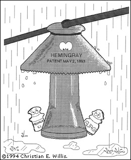
The true beginning of Laugh Lines was in May of 1994 when I drew my first insulator comic, "High and Dry" using SuperPaint on an Apple Macintosh Plus computer. The concept was inspired from a drawing I had seen on the April 1993 cover of Crown Jewels of the Wire Magazine, in which a bunch of flies are huddled under a big multipart with the caption "Boy, those umbrellas sure do work!" My twist on the concept gave personalities to the insulators themselves.
In January 1995, I produced five other comics on the computer as well, none of which I felt were good enough to be published. Then, in 1996, I decided to revamp the whole idea of producing an insulator comic. To start with, the comic needed a name! My dad suggested "Pole-ish Jokes", but I decided on "Laugh Lines," which I felt conveyed the play-on-words style of my comic better. I decided to draw these comics by hand as opposed to using the computer, as I had done with my old original comics.
On October 15, 1996, I wrote to Carol McDougald, who was the editor of CJOW then, and offered her my comic as a possible monthly feature. Much to my happiness, she accepted! I would print out the template from the printer, hand draw the comic on the paper and mail it out to Carol. These were the very early days of the Internet, so scanning in the artwork and uploading over a 14.4K modem wasn't really worth the effort!
In 1999 and 2000, I stopped drawing as my interests were diverted to college. In 2001 I resumed production. Now armed with a "super fast" DSL internet connection and my own scanner, I was able to start scanning my comics back into the computer and send them over via email rather than snail mail. Starting with Laugh Lines #25, I began scanning the comics into the computer and using Adobe Photoshop to shade the comic (which I still continue to do today).
In 2008, Laugh Lines reached its 100th comic milestone! As a special tribute, it was the first comic drawn in color and was featured on the cover of Crown Jewels of the Wire Magazine, May 2008). Back then, the inside pages of the magazine were black and white, and only the cover was in color, so I never bothered to use color in any of my comics because no one would ever see it! That all changed when Crown Jewels became a full-color magazine, so starting with Laugh Lines #102, all comics were now being produced in color.
Also in 2008, I published "Laugh Lines: The First 100 Comics", a compilation of all the comics I had drawn to date, including many of my previously unpublished comics, sketches, and character profiles. The book was limited to 100 hand numbered and signed books. I included a free glass spool insulator with each purchase, and by 2012 they had all sold out to members of the hobby (where I hope they are still read and enjoyed!)
In 2009, I took another break to focus on my family and finishing my Bachelor's degree, and we moved to Colorado in 2010. Once we got settled there, I resumed production from 2011-2012. That was the last time I was regularly producing comics for Crown Jewels. With a full time job, a family, and volunteering for the National Insulator Association, I was simply running short on ideas and time.
Today, I am the Managing Editor for Drip Points Magazine, the official magazine of the National Insulator Association. When inspiration strikes (and I have sufficient time), you may find an occasional new Laugh Lines show up in the magazine!
My first logo (1996-1998), drawn in Aldus PageMaker. This logo served me well until March of 1998, when I decided to revamp the logo.
Second logo (1998). This second logo was only used for 8 issues. I used a modified version of the 1980s "Beckman Instruments" font for this design, and a photo of a CD 112.4 insulator in the middle.
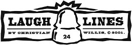
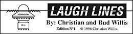
Third logo (2001-2008). When I restarted production of Laugh Lines, I wanted a fresh look so I redesigned the logo again, using a rough, hand-carved style design and western style fonts.
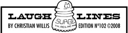
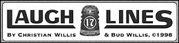
Current logo (2008-Present). After I hit 100 issues of Laugh Lines, my Li'l Surge character had become sort of the "poster insulator" for Laugh Lines, so I thought it only fitting that he should be featured. I also felt that the previous logo took up too much room. With this design I reduced the height, allowing for a larger comic area.